Seasonal Trends in NYC Traffic: STL Part I
Everyone knows that traffic is much worse during the week than Sundays. But how much so? And how much does traffic change from month to month? Does traffic decrease in the summer because people take vacation, or do those vacationers clog the roadways? Given all of these fluctuations in traffic, how do we quantify long term trends?
In data science, these questions fall are referred to as seasonality. A wonderful technique to address these questions is Seasonal and Trend decomposition using LOESS (STL). This the first of a three part series on STL. In this post, we’ll look at a test case of traffic from the John F. Kennedy Bridge in Manhattan. Part II delves into the weeds of how this works, and Part III discusses how STL can be used for imputing data over missing values, a key advantage over other means of decomposition.
The Data
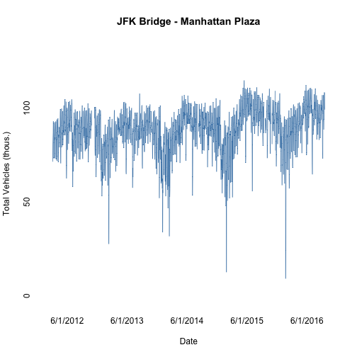
The dataset we have is of total daily tolls across the JFK bridge. The data were scrapped from the MTA. All of the data aggregation and analysis including this post in .Rmd form is available on GitHub. The cleaned data is a time series of daily data from March 2012 through September 2016.
head(jfkManhattan)## Source: local data frame [6 x 2]
##
## Date Total
## (date) (dbl)
## 1 2012-03-04 71.236
## 2 2012-03-05 80.855
## 3 2012-03-06 84.055
## 4 2012-03-07 86.691
## 5 2012-03-08 92.716
## 6 2012-03-09 91.656From the plot of the raw data, there is a clear yearly pattern. Traffic peaks in the summer and drops down, bottoming out around the January or February. On top of this pattern, there is a general increase in traffic over time. Additionally, there are variations that depend on the day of the week. This is a bit harder to see because of the density of data, but the daily variation is what causes the figure to look like a wide band.
Weekly Decomposition
Let’s start out by looking at the daily variation. The decomposition takes the average daily traffic for each month as the sum of three components: a seasonal component, a trend component, and the remainder. For each day \(t\), the traffic can be written as
STL is a particular algorithm to make this separation. The stl function exists in base R, but the stlplus package implements the same algorithm while allowing for missing data and has some nicer plotting features. The details of the algorithm are address in PartII, but the important parameter is n.p, the number of measurements in a full period of seasonal behavior. Since we are looking for a weekly effect, n.p should equal 7.
weekDays <- c("Su", "M", "Tu","W", "Th", "F", "Sa")

stlDaily <- stlplus(jfkManhattan$Total,t=jfkManhattan$Date,
                    n.p=7, s.window=25,
                    sub.labels=weekDays, sub.start=1)

plot(stlDaily, xlab="Date", ylab="Daily Vehicles (thous.)")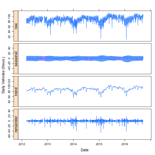
The top plot is the raw daily traffic data. The “seasonal” component is the daily variation that occurs with weekly periodicity (e.g. each Monday has the same seasonal component that only slowly changes.) The decomposition is done such that the seasonal term (approximately) averages to zero. The trend component is the slowly varying average daily traffic after accounting for the seasonal variation, which in this case are weekly. Once the seasonal and trend components are fit, they are subtracted from the raw data to give the remainder.
In the seasonal and trend plots, some of the data are colored purple. This is where there were gaps in the raw data. Because of the details of how the seasonal and trend components are fit, the missing data can be interpolated. The ability to impute missing data as the sum of the seasonal and trend components a very nice feature of STL that will be discussed in a later post.
The seasonal component is not perfectly periodic every seven days. The seasonal component shows long terms changes that are roughly yearly. The difference between weekday and weekend traffic is smaller in the summer than in the winter. The ability to capture this slowly changing seasonality is a key advantage of STL over other decomposition methods such as the decompose function in R and seasonal_decompose in Python.
The remainder terms has some large spikes, mostly drops. These are days are mostly around holidays. The ability to determine if a single measurement is unusually low or high by looking at the remainder is a typical use of seasonal decomposition.
Finally, the trend component has a clear periodic structure. This periodicity follows a yearly pattern. Having multiple seasonal periods is extremely common with time series data. As a general rule of thumb, it is easier to look first at the seasonality with the shortest period and work up to progressively longer seasonality. In the case of the traffic data, start with the weekly seasonality and then tackle the yearly seasonality.
Yearly Decomposition
To handle the yearly seasonality, one approach would be to aggregate the data to the month. Since each month has a different number of days, instead of looking at the monthly total, we can look at the daily average. But this still doesn’t fully solve all of the problems with aggregating to monthly as two months with the same number of days can have a different number of each day type. Some months might have five Sundays, while others only have four. This is exacerbated by the fact that the dataset is not complete and is missing some days. These types of problems are endemic in trying to extract seasonal behavior from time series data. The lack of consistency of the number of days and weeks in months, the number of days in a years, indivisibility of weeks into years, changing dates of holidays, etc. all create unique problems that require care when evaluating time series data.
Because we started with the short weekly periodicity, we can handle a lot of these issues by subtracting off the seasonal term for each day before aggregating. Because the seasonal component averages to (approximately) zero, this does not change the total traffic over the data set. After this subtraction, the value for each day is interpreted as how much traffic there would have been if it had been an average day type. This allows a Sunday to be compared directly to a Monday. The higher value means that there was more traffic compared to a typical day. The ability to do this is why it is typically easier to start with the faster seasonal analysis.
normalizedData <- jfkManhattan
normalizedData$Total <- normalizedData$Total - stlDaily$data$seasonal
day(normalizedData$Date) <- 1
normalizedData <- normalizedData %>%
  group_by(Date) %>%
  summarise_each(funs(mean(., na.rm=T)))

monthNames <- c("Ja", "F", "Mr", "Ap", "Ma", "Jn", "Jl", "Au", "S", "O", "N", "D")
stlNormalizedMonthly <- stlplus(normalizedData$Total, t=normalizedData$Date,
                                n.p=12, s.window="periodic",
                                sub.start=3, sub.labels = monthNames)

plot(stlNormalizedMonthly, xlab="Date", ylab="Daily Vehicles (thous.)")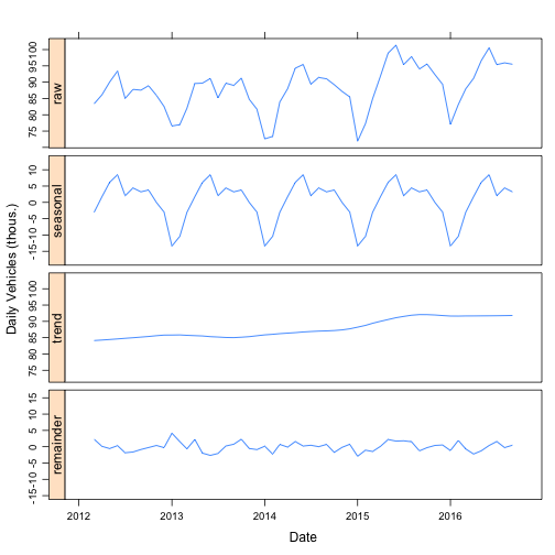
Now the seasonal term shows that the summers have the highest traffic. Winter is the lowest, with January the lowest month. The trend line shows that traffic has increased by almost 10 percent over the past four years. At a monthly level, the remainder term is fairly flat with no clear anomalous months.
By moving to the monthly analysis, what had previously been seen in the trend term in the daily analysis is shifted to the seasonal. This shift demonstrates how seasonal decomposition is an intrinsically ambiguous process. The assignment of temporal variation into seasonality, trend, or remainder, is a matter of opinion and what features are relevant to the modeler.
Subseries Analysis
A nice way of visualize the decomposition, is plotting the seasonal component by the subseries. A subseries is the set of observations of one season type. For example, all of the Mondays, or all of the Januaries. Each subseries plot is a time series of the seasonal component across the whole time range of the data set.
library(gridExtra)
p1 <- plot_cycle(stlNormalizedMonthly, ylim=c(-17, 17), ylab="Yearly Seasonality")
p2 <- plot_cycle(stlDaily, ylim=c(-17, 17), ylab="Weekly Seasonality")
grid.arrange(p1,p2, ncol=2)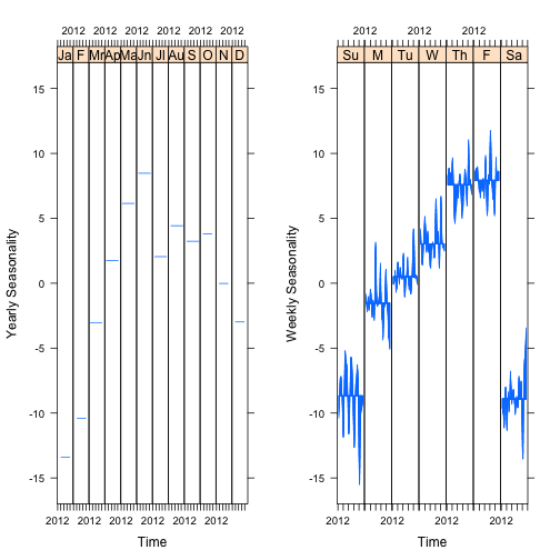
These figures allow for easy interpretation of the size of the seasonality. For example, the monthly dependence of traffic is similar in size to the weekly variation. The difference between traffic on a Sunday versus a Monday is about the same as the difference between traffic in January versus June.
Additionally, it is easy to see how the weekly seasonality shifts over time. The yearly seasonality is constant, which is a limit of the size of the data. Since the data cover five years, each month only has five observations. Any variation over five observation would likely be the result of over fitting.
Conclusions
I hope this has been a useful introduction to how seasonal decomposition and STL can be used to assess the seasonal components of a time series. Using this technique on the traffic on the JFK bridges shows that, unsurprisingly, traffic has a strong weekly seasonality. Most days on the bridge see between 75 and 95 thousand vehicles a day. With STL, we can quantify that the difference between a typical Sunday and a typical Thursday or Friday is 15-18 thousand vehicles, which about 15-20% of the total traffic. More surprising, the difference between a typical day in January and a day in June is about 23 thousand vehicles. The trend component shows that traffic has increased from an average of 84 thousand vehicles to to 92 thousand vehicles (about 10%) since 2012.